Data Interpretation
Data is collected information that can be organized through visual representations called graphs or diagrams. We can also tabulate data to ease our analysis with it.
Interpreting data means looking at a particular graph, diagram, or table and concluding. Assessment exams usually involve data interpretation questions to gauge the examiner’s ability to visually make sense of the information presented.
Learn different tricks and strategies to answer data interpretation questions in this article.
Click below to go to the main reviewers:
Ultimate Civil Service Exam Reviewer
Table of Contents
- What Is a Graph?
- Data Interpretation Tips and Strategies: Graphs
- 1. Look First at the Graph’s Title
- 2. Understand What Is Being Asked
- 3. Learn How To Compute Percentages
- 4. Observe the Trend of the Data
- 5. Learn How To Provide Logical Explanations Behind the Trends
- 6. Review Your Knowledge of Fractions
- 7. Recall How To Compute for Average
- 8. Pay Attention to the Scale Used
- What Is a Table?
- Interpreting Data Presented in a Table: Tips and Strategies
- Download Article in PDF Format
- Test Yourself!
What Is a Graph?
A graph is a visual diagram used to represent data. We use them to present information more engagingly and concisely.
Review of Different Types of Graphs
Listed below are the different graphs that can be used for data presentation:
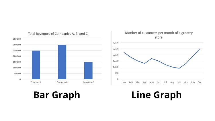
- Bar Graph – used to compare quantities of different categories and can be horizontal or vertical. This graph comprises two axes indicating either numerical or categorical (qualitative) variables.
- Line Graph – used to show how data changes over time. The horizontal and vertical exes are also used to compare two variables.
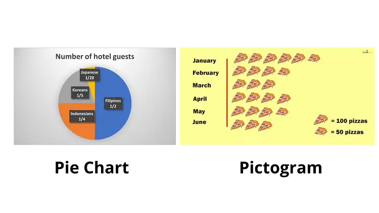
- Pie chart – used to present the composition of a whole data into subcategories.
- Pictograph – uses images or symbols to represent data.
If you want to refresh your knowledge of how these graphs work, read our article about graphical analysis. This review will focus more on test-taking strategies to answer data interpretation questions.
Parts of a Graph
Every graph has the following parts, which you must recognize to be able to interpret:
- Title: This indicates what the graph tells you. Look for the “keywords” as hints to understand what the graph depicts.
- Horizontal and Vertical Axes: These are where the quantities or categories are placed.
- Variables: These are the information being presented in the graph, like “number of students,” “sales per month,” “total population,” and so on.
- Scale: This provides the quantities for each axis.
Take a look at the line graph below:
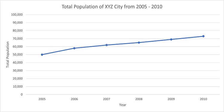
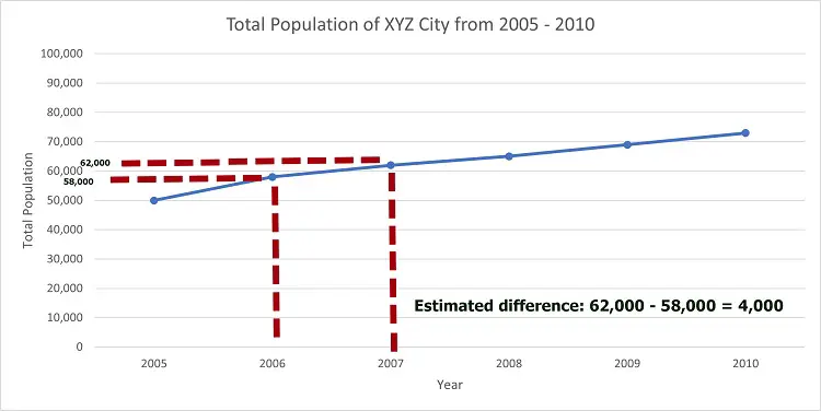
From the title of the graph shown above, we can see that it presents the total population of a particular city from 2005 to 2010. Since we have a line graph, then we expect that there will be some changes in the total population throughout the aforementioned years.
The horizontal axis represents the variable “Year.” The scale for the axis is pretty simple as it only lists the years in chronological order (2005, 2006, 2007, and so on).
Meanwhile, the vertical axis represents the variable “Total Population.” The scale for this axis is made by counting 10,000. The vertical axis starts with 0, followed by 10,000, 20,000, and all the way to 100,000.
Using these parts of a graph, we can now interpret the data it depicts.
Let us try to answer these questions:
- What was the population of XYZ city in 2005?
- What is the population trend of XYZ city from 2005 to 2010?
- Provide an estimate for the total population difference between 2006 and 2007.
Answers:
- To find the total population in 2005, we look at “2005” in the horizontal axis. We take its corresponding total population by looking at the vertical axis. Doing this method, we get 50,000 as the total population in 2005.
- Trend refers to the overall behavior of the data. Since we are dealing with population, there are only two possible trends–either the trend is increasing (the population is increasing throughout the years) or decreasing (the population is decreasing throughout the years). The line graph seems upward as it moves to the right of the horizontal axis. This suggests that the trend of the population of XYZ city is increasing.
- Note that the line graph does not allow us to get an exact value for the population for the years 2006 to 2010. Thus, we need to estimate. In 2006, the population seemed near 60,000 but short of it. So, if we provide an estimate, the 2006 population may be around 58,000 to 59,000. Let us use 58,000 as an estimate. Meanwhile, for 2007, the population is also very near to 60,000 but exceeds it. So, let us estimate the population as 62,000. Using our estimates, we have 62,000 – 58,000 = 4000. Hence, the estimated difference is around 4000.
See below for how we estimate the difference in the 2006 – 2007 population:
However, a particular type of graph presents data without using axes. Can you guess what it is?
Yes, that’s the pie chart. This type of graph presents the composition of particular data into subcategories. Take a look at an example below:
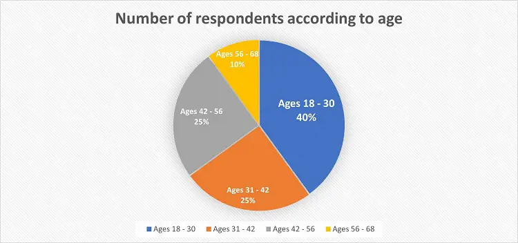
We have a pie chart representing the respondents’ distribution according to their age. Looking at the pie chart, we provide some interpretations of the data it presents.
- What age bracket has the highest percentage in the total number of respondents?
- What age bracket has the lowest percentage in the total number of respondents?
Answers:
- The age bracket 18 to 30 has the highest percentage in the total number of respondents (40%).
- The age bracket 56 – 68 has the lowest percentage in the total number of respondents (10%).
Take note that in any pie chart, the total percentage of the entire chart is always 100%. This means that when you add all the percentages of each category, the resulting value should be 100%. Using this fact, let us answer this example:
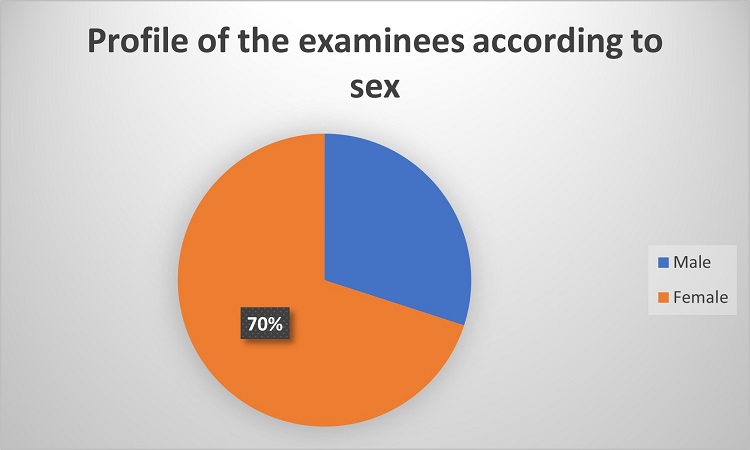
Based on the pie chart above, what is the percentage of male examinees?
Since the total percentage of a pie chart is always 100%, then the percentage of male examinees is 100% – 70% = 30%.
Hence, the percentage of male examinees is 30%.
Suppose the total number of examinees is 2,000. Can you determine the number of female examinees?
To answer this, we must multiply 2,000 by the percentage of female examinees (70%). To do this:
2,000 x 70% = 2,000 x 0.70 = 1,400
Hence, the total number of female examinees is 1,400.
Data Interpretation Tips and Strategies: Graphs
Now that you have an overview of graphs and how to interpret them, we are sharing some tips and strategies you can employ to answer data interpretation questions related to graphs.
1. Look First at the Graph’s Title
This provides the context of the data presented. If the graph has no title, read its corresponding question to get its context. Remember, context allows you to make sense of the figures and enables you to tell the story of that graph.
Look at the untitled graph below.
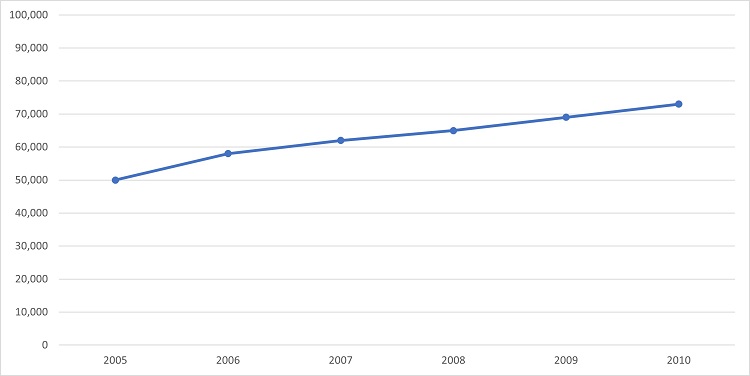
Can you create any interpretation with it? Of course not. That’s why you must know its title as well as the labels of the axes.
Once the title and axes of the graph are defined, we can now tell a story from it. Here’s the picture of the same graph but with the title and labels.

2. Understand What Is Being Asked
Comprehending the given question is essential to arrive at the correct answer. You may interpret the graph well, but failing to understand the question will lead you nowhere.
Look at the given graph below.
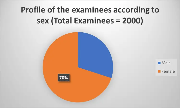
Let’s say the given question is: “How many male examinees are there?”
If your answer is 30%, you failed to answer the given question correctly. The correct answer can be determined by multiplying 2,000 by 30% (2,000 x 0.30 = 600). Note that the question pertains to the exact number of male examinees, not their percentage.
3. Learn How To Compute Percentages
This is important, especially when answering questions related to pie charts. Our previous example shows that the total number of examinees is 2,000. If 30% of examinees are male, what is the total number of male examinees?
You need to compute the percentage by multiplying 2,000 by 30%:
2,000 x 0.30 = 600
Hence, the total number of male examinees is 600.
4. Observe the Trend of the Data
This is helpful when dealing with line graphs. The trend allows you to discern the relationship between two variables.
If the trend is increasing, then it means that the variables have a direct relationship. In other words, if one variable increases, the other variable should also increase.
Below is an example of an increasing trend:
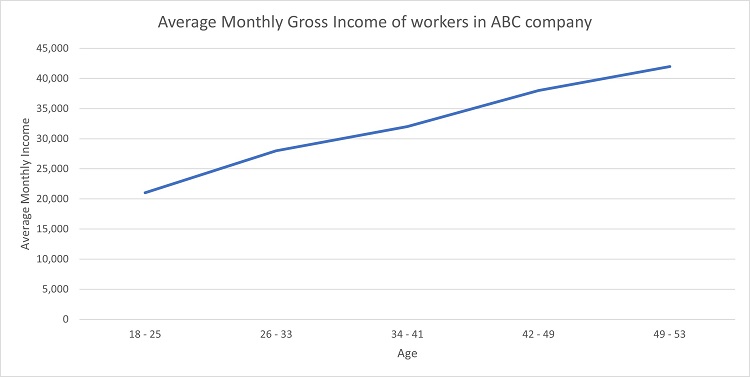
As we can see, the line graph has an increasing trend. This suggests a direct relationship between “age” and “average monthly gross income.” This implies that as the age of the workers of this company increases, their average monthly gross income increases as well.
On the contrary, if the trend decreases, the variables have an inverse relationship. In other words, if one variable increases, the other variable decreases, and vice versa.
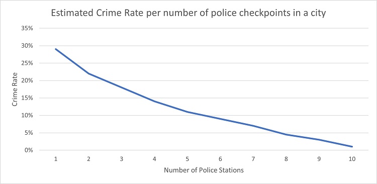
The graph above depicts a decreasing trend behavior. This means that as the number of police checkpoints in a city increases, the crime rate in that city decreases.
However, most of the cases involve graphs with no single trend. It could be the case that it exhibits an increasing trend for a particular interval and then a decreasing trend afterward. Take the example below:

From January to April, the graph exhibits a decreasing trend. Then, April and May are characterized by an increasing trend. After that, the trend decreases until September. Eventually, the trend increases again in the remaining months.
5. Learn How To Provide Logical Explanations Behind the Trends
It’s not enough that you can recognize trends in a graph, it’s also essential to know why such trends happen. Let’s go back to our previous example about the number of customers of a particular grocery store.
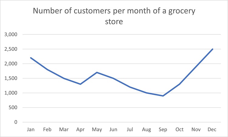
Suppose that you’re asked why there’s an increasing trend from September to December.
A probable explanation is that during these months, the holiday season approaches, during which customers tend to shop more frequently for food, gifts, and decorations.
6. Review Your Knowledge of Fractions
Pie charts are sometimes presented not with percentage values but with fractional values, as shown below.
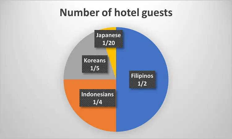
Suppose that the total number of guests in the hotel is 2,000. Can you determine how many guests there are per nationality?
- If ½ of the guests are Filipinos, then there are 1000 Filipino guests (half of 2000 is ½).
- If ¼ of the guests are Indonesians, then the number of Indonesian guests can be determined by multiplying 2,000 by ¼: 2,000 x ¼ = 500. You can also get the same result if you divide 2,000 by 4 (2000 4 = 500).
- If ⅕ of the guests are Koreans, then the number of Korean guests can be determined by multiplying 2,000 by ⅕: 2,000 x ⅕ = 400. You can also get the same result if you divide 2,000 by 5 (2000 5 = 400).
- If 1/20 of the guests are Japanese, then the number of Japanese guests can be determined by multiplying 2,000 by 1/20: (2,000 x 1/20 = 100). You can also get the same result if you divide 2,000 by 20 (2,000 20 = 100).
7. Recall How To Compute for Average
Some questions might ask you to compute the average of several sets of quantities. As a recall, the average can be computed by adding the given values and then dividing the sum of the total number of addends (the numbers you’ve added).
Below is a bar graph presenting the revenue of three companies, A, B, and C:
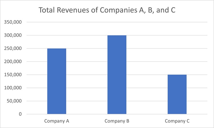
Compute the average revenue of three companies.
To find the average revenue, we need to add the respective revenues of the companies and then divide the result by 3:
(250,000 + 300,000 + 150,000) 3 = 233,333.33
Hence, the average revenue of the companies is 233,333.33
8. Pay Attention to the Scale Used
Sometimes, the scale used in the axes has additional information that you have to take into account. Make sure to pay attention to it to arrive at an accurate answer.
Take a look at the graph below.
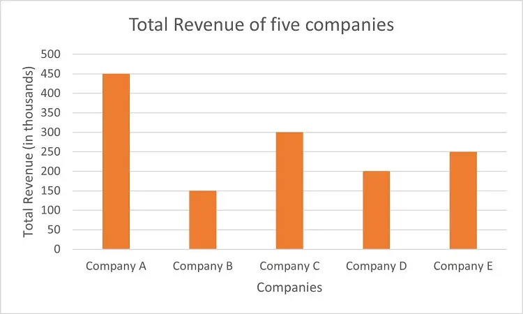
Note that in the vertical axis, there’s a note inside the parenthesis stating that the values are in thousands. This means that the value indicated there is actually in thousands. For instance, the “450” on the vertical axis represents 450,000.
Suppose that you were asked to find the difference between the total revenues of companies A and B. In the table above, company A’s rectangle coincides with “450,” while company B’s rectangle coincides with “150.” By subtraction: 450 – 150 = 300.
Note that the difference is not 300. Again, the values in the vertical axes are in thousands. Hence, the actual difference between the revenues should be 300,000.
What Is a Table?
Graphs are not the only way to present data. Tables are also an effective tool to convey information. With a table, we can arrange a set of information in rows or columns
Here’s an example of a table:
Top 5 Most Populous Provinces in the Philippines in 2020
| Province | Total Population |
| Cavite | 4,344,829 |
| Bulacan | 3,708,890 |
| Laguna | 3,382,193 |
| Rizal | 3,330,143 |
| Cebu | 3,325,385 |
As mentioned in the table’s title, it presents the total population of the five most populous provinces in the country as of 2020. The left column indicates the province, while the right column tells the total population of the corresponding province. For instance, Cebu has a population of 3,325,385.
We can also deduce several pieces of information from the table above, like the difference between the population of the two provinces. For instance, the difference between the populations of Cavite and Bulacan is 4,344,829 – 3,708,890 = 635,939. You can conclude from this result that Cavite has 635,939 more people than Bulacan.
Here’s another example of a table:
Annual Philippine Average Inflation Rates (2018 – 2021)
| Year | Average Inflation Rate |
| 2018 | 5.2 |
| 2019 | 2.4 |
| 2020 | 2.4 |
| 2021 | 3.9 |
The table above shows the yearly inflation rate of the Philippines. The first column indicates the year, while the second column tells the corresponding inflation rate (or how fast prices of goods and services increase).
Again, we can deduce several pieces of information from this table. For instance, the inflation rate in 2021 is higher than in 2020. This means that the price of goods in 2021 increased faster compared to 2020.
Interpreting Data Presented in a Table: Tips and Strategies
Here are some things to remember when answering data interpretation questions involving tables:
1. Look at the Title of the Table, if Given:
This gives you context on the values presented in the table. If the title of the table is not given, the question next (or before) might give you context.
2. Understand What Is Being Asked
It’s not enough that you understand the meaning behind the values presented in a table, it’s also vital to understand the given question based on the given table.
See our example below:
Entrance Fee in Lemongate Amusement Park
| Age | Price |
| Children (1 yr to 12 yrs) | ₱200 |
| Students /Teenagers (13 yrs to 17 yrs) | ₱250 |
| Adults (18 yrs and above) | ₱300 |
Here’s the given question: Suppose that a family with 2 children, 1 teenager, and 2 adults are going to the Lemongate Amusement Park. What is the total amount of the entrance fee they need to pay?
Note that we can answer the given question by referring to the entrance fee table provided above.
- If the entrance fee per child is ₱200, then two children have to pay 200 x 2 = 400 pesos.
- If the entrance fee per teenager is ₱250, then one teenager has to pay 250 pesos.
- If the entrance fee per adult is ₱300, then two teenagers have to pay 300 x 2 = 600 pesos.
This means that the total amount of entrance fee the family should pay is 400 + 250 + 600 = ₱1,250.
Here’s another example. The table below shows the daily sales of a musical instrument shop in a city:
| Day | Sales (in ₱) |
| Monday | 4,500 |
| Tuesday | 3,000 |
| Wednesday | 3,000 |
| Thursday | 4,000 |
| Friday | 1,500 |
| Saturday | X |
| Sunday | 2,500 |
The store clerk forgot to record the sales amount for Saturday. However, the cash register machine shows that the total sales for the entire week are ₱20,000. What are the total sales on Saturday?
We can answer the given problem by adding the sales indicated in the right column and then subtracting the sum from 20,000:
Sales on Saturday = ₱20,000 – (Total Sales on Mon, Tues, Wed, Thurs, Fri, and Sun)
Sales on Saturday = ₱20,000 – (4500 + 3000 + 3000 + 4000 + 1500 + 2500)
Sales on Saturday = ₱20,000 – 18,500
Sales on Saturday = ₱1,500
Therefore, the sales on Saturday is ₱1,500.
3. Review Your Knowledge of Basic Mathematical Operations
Some questions might require you to use mathematical operations together with table interpretation. Hence, as much as possible, review how to add, subtract, multiply, and divide different types of numbers such as whole numbers, fractions, and decimals.
Here’s an example of a problem that would require you to use basic operations with decimals:
The table below presents the exchange rate between the Philippine Peso (₱) and various foreign currencies:
| Foreign Currency | Exchange Rate (Equivalent of ₱ 1 in foreign currency) |
| US Dollars (USD) | 0.017 |
| Indian Rupee (INR) | 1.41 |
| South Korean Won (KRW) | 24.30 |
| Euro (EUR) | 0.017 |
| Australian Dollar (AUD) | 0.027 |
| Japanese Yen (JPY) | 2.52 |
Suppose that a foreigner bought an imported product from the Philippines worth ₱500. How much does he have to pay in the following currencies?
- USD
- KRW
- EUR
Answers:
a) From the table above, we can see that ₱1 = USD 0.017. Hence, we can find the equivalent value of the item in USD by multiplying 500 by 0.017: 500 x 0.017 = 8.5.
Hence, the item is worth USD 8.5.
b) From the table above, we can see that ₱1 = KRW 24.30. Therefore, we can find the equivalent value of the item in KRW by multiplying 500 by 24.30: 500 x 24.30 = 12,150.
Hence, the item is worth KRW 12,150.
b) Take note that by referring to the given table, we can see that the exchange rate for USD and EUR are the same (0.017). We have already computed that a ₱500-worth item costs 8.5 USD. This means that the item costs 8.5 as well in EUR.
Previous topic: Number Sequence
Return to the main article: Ultimate Logical and Analytical Reasoning Reviewer
Download Article in PDF Format
Test Yourself!
1. Practice Questions [PDF Download]
2. Answer Key [PDF Download]
Written by Jewel Kyle Fabula
Jewel Kyle Fabula
Jewel Kyle Fabula graduated Cum Laude with a degree of Bachelor of Science in Economics from the University of the Philippines Diliman. He is also a nominee for the 2023 Gerardo Sicat Award for Best Undergraduate Thesis in Economics. He is currently a freelance content writer with writing experience related to technology, artificial intelligence, ergonomic products, and education. Kyle loves cats, mathematics, playing video games, and listening to music.
Copyright Notice
All materials contained on this site are protected by the Republic of the Philippines copyright law and may not be reproduced, distributed, transmitted, displayed, published, or broadcast without the prior written permission of filipiknow.net or in the case of third party materials, the owner of that content. You may not alter or remove any trademark, copyright, or other notice from copies of the content. Be warned that we have already reported and helped terminate several websites and YouTube channels for blatantly stealing our content. If you wish to use filipiknow.net content for commercial purposes, such as for content syndication, etc., please contact us at legal(at)filipiknow(dot)net