Different Graphs in Statistics

Looking at raw data consisting of mind-boggling numbers will surely give a headache to anyone.
For this reason, people who constantly organize and arrange data create visual representations called graphs to summarize them.
Graphs are indispensable tools for those who generate information and insights from their data. Statisticians, scientists, economists, teachers, and even political analysts use graphs for their studies and to share their expert opinions with the public.
However, you don’t need to be a professional to analyze a graph. Graphs are created so that people can quickly grasp information extracted from a data set.
This review will teach you how to analyze graphs and use them to create meaningful interpretations and conclusions.
Click below to go to the main reviewers:
Ultimate Civil Service Exam Reviewer
Ultimate PMA Entrance Exam Reviewer
Ultimate NAPOLCOM Exam Reviewer
Table of Contents
What Are Graphs?
Graphs are visual diagrams used to present quantitative data. The goal of a graph is to make the presentation of data more concise and organized so that people can derive accurate information and insights from them in the shortest possible time.
Suppose there are 850 students in a particular national high school. These students belong to different grade levels. Suppose the school administration relies on the individual enrollment forms of the students. In that case, analyzing the distribution of students in different grade levels will take a lot of time.
To quickly identify how many students are enrolled in each grade level, the school administrators may use graphs to represent the data derived from the enrollment forms. Below is a bar graph presenting the number of students enrolled per grade level in the national high school.
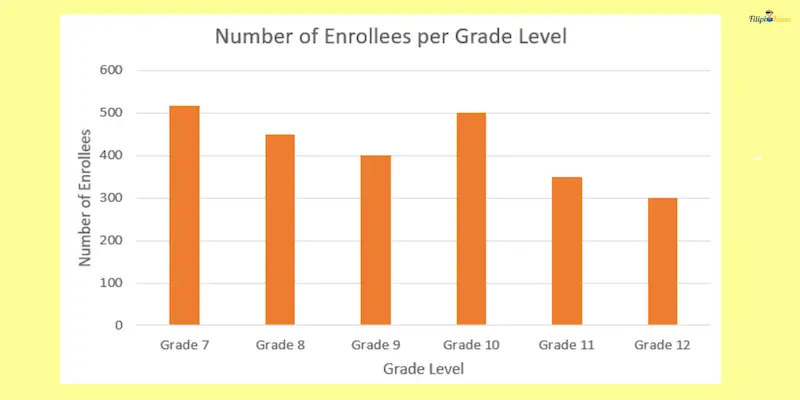
The bar graph above lets us quickly identify which grade level has the lowest or highest number of students. If we are going to rely on raw data, it will take too much time before we can create any conclusion.
Different Graphs in Statistics (With Sample Problems)
1. Bar Graphs
Bar graphs represent the amount or magnitude of a specific category. A bar graph can either be horizontal or vertical.
There are two axes in a bar graph. In a vertical bar graph, the horizontal axis indicates the categories, while the vertical axis indicates the magnitude or quantity of each category. On the other hand, in the horizontal bar graph, the horizontal axis indicates the quantity or magnitude of each category, while the vertical axis indicates the categories included in the graph.

Shown above are horizontal and vertical bar graphs presenting the monthly sales of a company from January to June 2018.
Notice that in a vertical bar graph, the horizontal axis indicates the category or the months being presented. Meanwhile, the vertical axis indicates the number of sales for each month. For the horizontal bar graph, the designation of the axes is reversed.
When Is a Bar Graph Used?
A bar graph is best used when comparing quantities of different categories.
Consider our previous example showing the monthly sales of a company from January to June 2018.
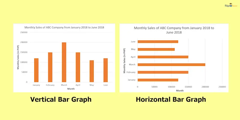
For instance, we can easily state that the company’s monthly sales during April 2018 were higher than in May 2018. We can also conclude that the month with the highest sales is March 2018. Similarly, the month with the lowest sales is May 2018.
Multiple Bar Graph
Multiple bar graphs indicate multiple pieces of information for each category. They come with a legend to indicate what information each rectangle represents.
Below is an example of a multiple bar graph for the average pretest and posttest scores of different Grade 10 sections in their Statistics class.
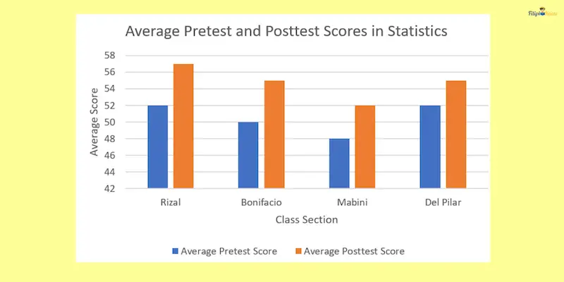
Note that for each category, there are two rectangles presented. Blue rectangles represent the average pretest score, while orange rectangles represent the average post-test score (refer to the legend below the multiple bar graph.
Sample Problem: A bar graph below shows the number of delegates per profession at a science conference.
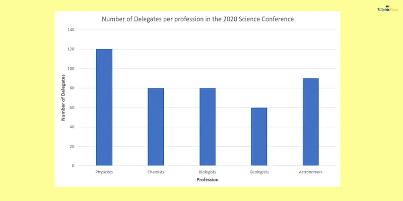
What is the difference between the number of physicists and geologists that joined the conference?
Solution: By looking at the graph, 120 physicists joined the conference. Meanwhile, 60 geologists joined the conference. The difference between the two is 120 – 60 = 60.
2. Line Graph
As the name suggests, a line graph is a graph that involves straight lines.
Below is an example of a line graph that presents the monthly inflation rate of the Philippines in 2018, based on the data obtained from the Philippine Statistics Authority (PSA).
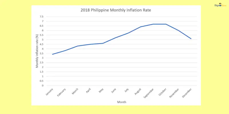
Again, we have two axes in a line graph. The horizontal axis usually indicates the period in a line graph. In our example below, the horizontal axis indicates the months in 2018. On the other hand, the vertical axis indicates the quantity being presented by the line graph. In our example, the vertical axis indicates the monthly inflation rate.
When Is a Line Graph Used?
A line graph is best used to show how data changes over time. It provides us with information on the trend or behavior of the numerical data as time progresses.
Refer again to the line graph of the monthly inflation rate of the Philippines in 2018. The graph above shows how the monthly inflation rate changes from January to its succeeding months. We can deduce from the line graph that the inflation rate continuously climbed from January 2018 until October 2018. Afterward, the inflation rate decreased from November 2018 until December 2018.
This suggests that the prices of goods and services in the Philippines in 2018 rose from January to October, eventually declining in November.
Multiple Line Graphs
We also have multiple line graphs with more than one line graph plotted. We use multiple line graphs to portray the difference in the rate of how certain variables change value over time. A multiple-line graph uses legends to indicate the variable represented by each line.
Shown below is an example of a multiple-line graph.
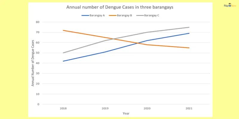
The multiple-line graph above presents the annual dengue cases in Barangay A, Barangay B, and Barangay C from 2018 to 2021. Note that by referring to the legend in the upper part of the line graph, we can see that the blue line represents Barangay A, the orange line represents Barangay B, and the gray line represents Barangay C.
The multiple-line graph above enables us to compare the behavior of each barangay in terms of the number of dengue cases. As we can see, only Barangay B has a declining number of dengue cases within four years. This is illustrated by the downward trend of the orange line that represents Barangay B.
Furthermore, although both Barangay A and C have increased dengue cases from 2018 to 2021, we can see that Barangay C has higher Dengue cases per year than Barangay A. This is because the gray line representing Barangay C is located above the blue line representing Barangay A.
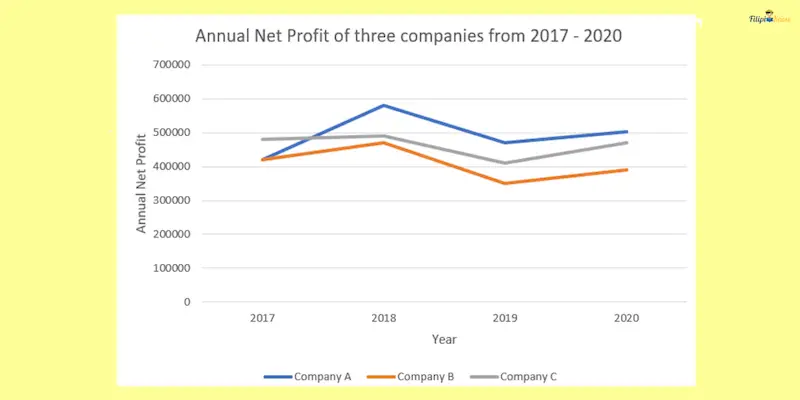
Sample Problem: Below is a multiple-line graph presenting three companies’ 2017 – 2020 annual net profit. Answer the questions below:
- Which company had the highest net profit in 2017?
- Provide an estimated annual net profit difference between Companies A and C in 2018.
Solution:
- The graph suggests that in 2017, Company C garnered the highest net profit. The gray line, which represents Company C, is plotted higher than other lines in 2017.
- Let us look at the respective annual net profit of Companies A and C for 2018. Unfortunately, the graph cannot provide us with an exact value for the net profit of each company for this year. However, we can somehow estimate their net profits based on the graph. For instance, the net profit of Company A in 2018 is about ₱590,000 (this is just an estimate based on the graph and not the actual value). On the other hand, the net profit of Company C in 2018 is about ₱500,000 (again, this is just an estimate based on the graph and not the actual value). Thus, the estimated difference in their net profit would be 590,000 – 500,000 = ₱90,000.
3. Pie Chart
A pie chart is a circular graph divided into “slices.” The entire pie chart represents the entire data set we are presenting. Meanwhile, each slice represents a portion of the data. The size of each slice is proportional to its numerical value.
Shown below is an example of a pie chart. This pie chart presents the annual budget of a small city.
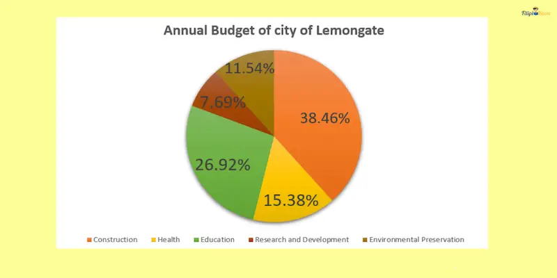
Look how the pie chart above shows us to which expenses the city’s annual budget was allocated. We can see that the budget is divided among “Construction,” “Health,” “Education,” “Research and Development,” and “Environmental Preservation.” The pie chart also tells us the percentage portion of each expense relative to the total budget. For instance, 38.46% of the total budget is allocated for construction.
When Is a Pie Chart Used?
A pie chart shows a “part-to-whole” relationship in a given data. In other words, we use this diagram to show the composition of the whole data. Going back to our previous example about the annual budget of the small city, we can present the composition of the entire budget by dividing it into different categories (e.g., Construction, Health, Education, etc.).
How To Interpret a Pie Chart?
Let’s go back to the annual budget of a small city presented as a pie chart.

Suppose that the total budget of Lemongate City is ₱130,000,000. Let us figure out the allocated budget for construction based on the given pie chart.
According to the given pie chart, 38.46% is allocated for construction. To determine how much is allocated for this category, we multiply the total budget (which is ₱130,000,000) by the percentage allocation for construction (which is 38%):
130,000,000 x 0.3846 = ₱49,998,000
Therefore, out of the ₱130,000,000 annual budget of Lemongate City, ₱49,998,000 is allocated for construction.
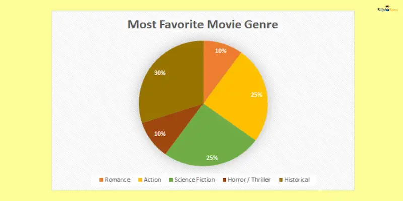
Sample Problem: Below is a pie chart presenting the favorite movie genres of 200 Lemongate City High School students.
Answer the following questions:
- How many students have romance as their favorite movie genre?
- How many students have science fiction as their favorite movie genre?
- How many students have a favorite movie genre that is not action?
Solution:
- According to the pie chart, 10% of 200 students have romance as their favorite movie genre. Thus, 0.10 x 200 = 20 students have romance as their favorite movie genre.
- According to the pie chart, 25% of 200 students have science fiction as their favorite movie genre. Thus, 0.25 x 200 = 50 students have science fiction as their favorite movie genre.
- According to the pie chart, 25% of 200 students have action as their favorite movie genre. This implies that 100% – 25% = 75% of students have a favorite movie genre that is not action. Thus, we have 0.75 x 200 = 150 students.
4. Pictograph
From the portion of the word itself, “picto,” we can quickly guess that this type of graph involves images. That’s precisely what a pictograph is: a graph that uses images or illustrations to present data.
Below is an example of a pictograph illustrating the number of T-shirts sold by Lemongate Fabrics in an entire week.
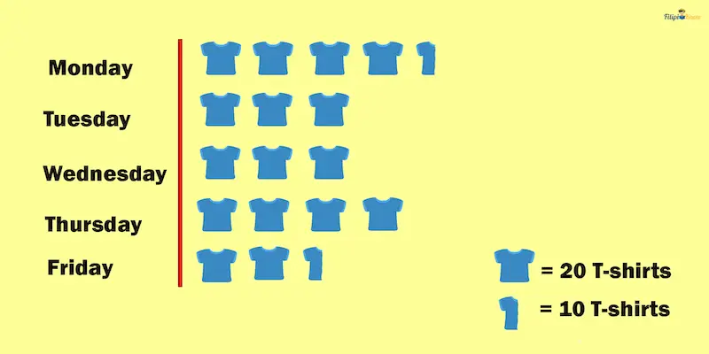
As you can see, each T-shirt icon is equivalent to 20 T-shirts sold, while the “half” T-shirt icon represents 10 T-shirts sold.
For instance, we can see that Lemongate Fabrics sold 90 T-shirts on Monday because it has four T-shirt icons that represent 80 T-shirts sold (4 x 20 = 80). Furthermore, it has one “half” T-shirt icon representing 10 T-shirts sold (1 x 10 = 10). Hence, the total number of T-shirts sold on Monday is 80 + 10 = 90.
When Is a Pictograph Used?
A pictograph is best used to illustrate organized data engagingly. If done correctly, a pictograph can be colorful and visually appealing, enticing readers to analyze the data further.
However, pictographs can be misleading or confusing if the icons or images are not well-defined. Hence, the images must be made correctly to make data interpretation easier.
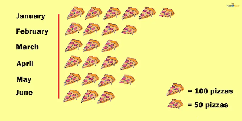
Sample Problem: Below is a pictograph presenting the number of pizzas sold by Lemongate Hut for the last six months.
- How many pizzas are sold in March?
- Which month has the highest number of pizzas sold?
Solution:
- There are three “whole” pizza icons illustrated for March. Hence, the total number of pizzas sold that month is 3 x 100 = 300.
- January has the highest number of pizzas sold because it has the most pizza icons in the pictograph.
Next topic: Limits
Previous topic: Factorials, Permutations, and Combinations
Return to the main article: The Ultimate Basic Math Reviewer
Download Printable Summary/Review Notes
Download Printable Flashcards
Test Yourself!
1. Practice Questions [Free PDF Download]
2. Answer Key [Free PDF Download]
3. Math Mock Exam + Answer Key
Written by Jewel Kyle Fabula
in Civil Service Exam, College Entrance Exam, LET, NAPOLCOM Exam, NMAT, PMA Entrance Exam, Reviewers, UPCAT
Jewel Kyle Fabula
Jewel Kyle Fabula graduated Cum Laude with a degree of Bachelor of Science in Economics from the University of the Philippines Diliman. He is also a nominee for the 2023 Gerardo Sicat Award for Best Undergraduate Thesis in Economics. He is currently a freelance content writer with writing experience related to technology, artificial intelligence, ergonomic products, and education. Kyle loves cats, mathematics, playing video games, and listening to music.
Copyright Notice
All materials contained on this site are protected by the Republic of the Philippines copyright law and may not be reproduced, distributed, transmitted, displayed, published, or broadcast without the prior written permission of filipiknow.net or in the case of third party materials, the owner of that content. You may not alter or remove any trademark, copyright, or other notice from copies of the content. Be warned that we have already reported and helped terminate several websites and YouTube channels for blatantly stealing our content. If you wish to use filipiknow.net content for commercial purposes, such as for content syndication, etc., please contact us at legal(at)filipiknow(dot)net